Apple iOS 9 - some new features, lots of potential
Sticking to its usual practices, Apple unveiled the new iOS 9 in June, but at that point it didnt cause too much excitement. Looking much like iOS 8 and bringing only a handful of new features, it didnt stay in the spotlight for long.
Now, a few months later things are different - the iOS 9 biggest update wasnt mentioned at the announcement for understandable reasons - its the support of the new 3D Touch display and the API that will be available to game and app developers. Depending on how it goes with the early adopters, this feature alone has the potential to alter the way we interact with our phones the same way the first capacitive display and the multi-touch gestures did.
The support for 3D Touch allows for another level of interaction, press the screen for a bit longer (and harder). This gets you access to extra actions and contextual options and we cant wait to see how say, game developers put that to use in the months to come. Well get back to examining Touch ID and its impact on iOS 9 in a short while, but first lets cover the basics of the new Apple platform.
iOS 9 brings a couple of new apps - News and Notes, while also enhancing Maps with public transit support. Mail and Messages got refreshed and theres a new system font. Meanwhile Siri got smarter, while Spotlight Search expanded its reach.
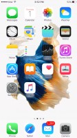
Visually iOS 9 looks the same as its predecessor. All of your apps are on the homescreen, you can group them in folders and there is the familiar dock that can take up to four shortcuts. System icons, color themes and transparency - everything is like we left it in iOS 8.
The lockscreen hasnt changed much either, but it now supports Live Photo wallpapers - they are either short animations or you can use one of thoseLive Photos that the iPhone 6s duo is capable of capturing. For the animation to activate, you need to press firmly on the screen, which is somewhat counterintuitive and we doubt it will be an oft used feature as nobody would really want to hard press the screen for 3 seconds just to see their lockscreen wallpaper move a bit.


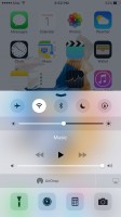
The Control Center thats pulled up from the bottom of the screen keeps the same layout of toggles, shortcuts and media controls. The Notification Center drops from the top and features the same Today and Notification tabs. There are no new widgets or notification options.
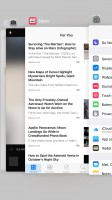
The task-switcher interface loses its webOS flat cards look and opts for a cooler 3D carousel. Unfortunately, you are still able to only see just three apps, and it takes even more scrolling so were not quite happy with this change.

No comments:
Post a Comment